Simple is nice
Early on in my career, I learnt that the real beauty lies in the details.
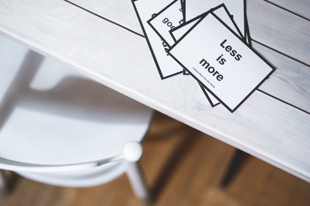
The way different entities in the technology value chain treat attention to detail differs significantly. It isn’t uncommon to stumble upon cluttered design loaded with unnecessary details pass off as an essential deliverable. I hate to break it to you that for a designer who is in check with the users’ real needs, less is more.
Paying attention to the detail of a design implies mindfully assessing and refining every element of your design irrespective of the complexity. A well thought-out design includes only what is necessary, and those necessary elements are made to look stunning. Creativity is not equal to clutter. A lot of designers give into the urge to add a lot of elements in an attempt to make their product look complete. My experience has taught me that it's easy to stray but simplicity is powerful. It is a beautiful way to focus on what matters and then really make it shine.

Many of us are obsessed with copying what is trending without really giving a serious thought about making everything work together. A good product designer efficiently hacks together the skills they need. Whether or not you’re a designer, we hope this blog helps you sharpen your product sense and improve your eye for design.
Move from Good to Great
The best designers do not stop until they deliver a product that’s great. They do not settle only for the good. Here are some ways you can make greater strides and lead the shift :
Analyse designs that impress you
- Study every detail
- Learn about the inspiration, the process and the journey
Leave your design alone for a few days
- When you design something you love, let it be.
- Revisit a few days later and allow yourself time to refine anything you may have overlooked
Look closer
- Ensure you zoom into your design often. It will help you stay clear of the mediocre lapses.
- Look at the shapes, colors, vectors . If you find minor flaws, fix them.

Learn from the apps you love
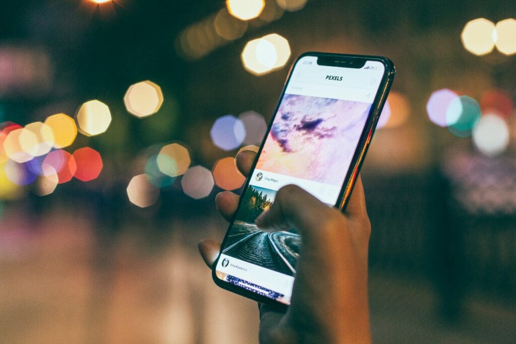
A good way to develop your design eye is by imagining yourself as the designer of a product. Here’s a simple exercise I would recommend - Think of an app you love & use often, open it and focus on what you see.
Here are some factors to help you navigate your observations:
Visual Hierarchy
- How does the design guide your focus?
- What information is highlighted?
- How well does the right information captivate your attention to take the right steps?
- How do colors and text articulate the importance of specific elements?
Content
- What is the tone of the content that is delivering this experience?
- How has visible & invisible content been treated?
- Is the content aligned well with the your behaviour as you look through it?
- What roles does the spacing have when framing the content?
Intent
- What problem does the app solve?
- Why would someone open it?
- How could design help to solve that problem further?
Target Audience
- Who is the product built for?
- Can you think of use cases that could be different from yours?
- Can design serve these use cases?

Challenge the status quo - Everyday!
A good design eye is often accompanied by an open and mindful state of mind. Study every design that inspires you. Learn as much as you can from apps. Understand the design team’s thought process and challenge yourself to think differently. What separates a good product from a great product is how relentless the designers are.
We sincerely hope that our post has pushed you to go that extra mile and have that additional attention to detail. We would be eager to hear your feedback about our thoughts. All you need is Facebook to share your comments below 👇. Excited to hear from you.


